Churchill Unveils 2016 KY Derby, Oaks Logos
Image:
Description:
Churchill Downs Racetrack July 21 unveiled the official logos for the 2016 editions of the Kentucky Derby (gr. I) and Kentucky Oaks (gr. I).
The logos were designed by SME, a New York-based marketing agency that has developed the official Derby and Oaks marks since 2007. The 142nd runnings of the Longines Kentucky Oaks and the Kentucky Derby Presented by Yum! Brands will take place on May 6 and 7, respectively.
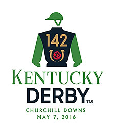
For the Kentucky Derby 142 logo, a 1920s-inspired design evokes the glamour of Derby's past and present—the simple identity of the jockey silks icon around the horseshoe rose and numeral 142, Churchill Downs said in a press release. The font chosen for the word "Kentucky" is reminiscent of movie title cards from the 1920s to reinforce the vintage look. The more contemporary font used for the word "Derby" provides balance to the composition and completes the logo, according to the release. For the 142 event mark, a traditional color palette in classic Derby red and gold is accentuated with an energetic forest green and a strong foundational charcoal gray.
"This year's mark features a classic jockey icon similar to those found in racing programs, while the negative space under the arms is a subtle nod to the iconic Twin Spires of Churchill Downs," said Ed O'Hara, senior partner at SME.
The Kentucky Oaks 142 logo continues the horseshoe imagery established two years ago that features the stargazer lily and the number of years the race has been run. The use of pink in the design reflects the Oaks Day "Pink Out" theme and Churchill Downs' continued commitment to generate awareness regarding breast and ovarian cancer education.