BH 100: Pressing On
Link:
Image:
Description:

Photo: BloodHorse Library
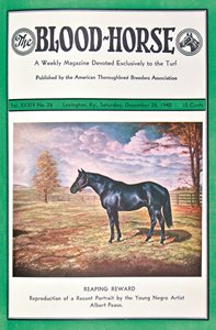
Color on the cover of The Blood-Horse for the first time: Albert Pease's portrait of Reeping Reward on Dec. 28, 1940
This feature originally appeared in the November 5, 2016 issue of BloodHorse.
The Blood-Horse staff of the 1960s and early 1970s thought of the following as two milestones: The first full color cover was on the Dec. 24, 1966, issue, and some color photos of sale prospects appeared in William Floyd’s Fairway Farm advertisements. In those old days of the printing technique known as letterpress, color reproduction involved ordering four-color plates from out of town and then relying on the printing firm used in Lexington to get all four inks laid down in the proper register via several passes through a printing press.
Some 20 years later The Blood-Horse executive editor Charles H. Stone came up with the idea of reproducing small images of all covers in the history of the magazine in a commemorative Collector’s Edition. Developing that project uncovered the stunning (to us) realization that The Blood-Horse had had one four-color cover as early as 1940! The final issue of that year, Dec. 28, featured a color reproduction of a portrait of Reaping Reward. The painting had been done by a young African-American, Albert Pease. A portrait of Equipoise done by Pease had been on the cover of the second issue of the year, Jan. 13, but in the ubiquitous black and white of the era.
The 1940 commentary about the Reaping Reward cover explained that Pease was the son of a trainer of the same name. The son was a groom in the Louisville-based stable of trainer Phil Reilly. In his leisure time Pease created small oil paintings using pictures on the cover of the magazine—and his imagination when it came to precise coat colors, etc. He mixed his “paints on his fingernails because he could not afford a palette.” Reilly brought his art to The Blood-Horse’s attention.
The notes about the color cover extolled that the artist’s “extraordinary natural talent for delineating the conformation of the Thoroughbred had attracted the attention of the editors. For the last issue of the year, and for the magazine’s first venture into four-color printing, a portrait of Reaping Reward, the most recent work of the 24-year-old painter, has been chosen.”
Reaping Reward (Sickle—Dustwhirl, by Sweep) was an older half brother to Triple Crown winner Whirlaway and won the Kentucky Jockey Club Stakes and three other stakes in 1936 and 1937. He sired 18 stakes winners, including 1950-51 champion sprinter Sheilas Reward. Reaping Reward stood at the Shaffer family’s Coldstream Stud in Kentucky. Pease’s painting was done for E. Dale Shaffer, who gave his permission for it to be reproduced on the cover.
A dozen years after the Reaping Reward cover, a Pease portrait of Rose Leaves with her suckling foal—later to be named Bull Lea—was used to illustrate an article about the mare in the inside pages. Pease, by that time, had had some commissions from noted horsemen, including Major Louie Beard, and his subjects had included Twenty Grand and Top Flight.
Then in 1969 Pease’s color portrait of Domino appeared in full color on the cover of the issue of May 31. The edition included an article on Domino that was part of a series “The Great Ones,” which later was collected in book form.
Irrespective of what few instances of color reproduction might have appeared in the interior pages of the magazine from 1940 through most of 1966, there was not another four-color cover until the aforementioned Christmas Eve date of 1966. The editor of that time, Kent Hollingsworth, was well steeped in the history of racing in general and of The Blood-Horse in particular, but he must have been unaware of the 1940 Reaping Reward cover. He wrote proudly of the 1966 colorful hunt scene by Samuel Alken, part of splendid art collection that had been installed at Santa Anita:
“This being Christmas and all, we went all the away, dressing this issue in all the color we could find. Now to Fortune, or National Geographic, or Sports Illustrated, a cover without four-color separations (printing jargon) is counted a cover lost,” in contrast to the realities of The Blood-Horse. “More precisely stated, this is our first full color reproduction of an oil painting in 50 years of publication.” (Sorry, young Albert and Reaping Reward.)
It would be some years before any news or immediacy was depicted in color covers. Where color was most often utilized was to introduce topics of art. In 1967, of the nine color covers, five were of paintings of horses, one was a photograph of the Calumet Farm trophy case, one a rather general scene of Hialeah, and one a color conformation photo of Bold Ruler.
A favorite of the undersigned was a portrait of head and neck of the 1880s champion Hanover. Artist Henry Stull had depicted Hanover on the palette itself (thumb hole intact), creating a sense of light around the horse’s head via other colors. The painting appeared on the Feb. 11, 1967 cover.
Over the next few years color covers continued to involve art, stock photos of champions, sale ring scenes, and sweeping landscapes. The first race photo to grace the color in cover was a somewhat shadowy likeness of Canonero II heading to the wire for the Kentucky Derby upset of 1971. Thereafter photographers grew more proficient with color and logistics, such as driving through the night to a friend who could develop film quickly, pushed the progress forward.
Tony Leonard’s photo of Secretariat winning the Derby in 1973 with not a foot on the ground was a breakthrough in combining timeliness with sharp quality color reproduction. Such was Leonard’s moxie that he was able to make it seem remarkable that he had unveiled to us that Secretariat ran that way, although every running horse reaches that airborne point in every stride.
It was not until 1981 that every cover of a year was presented in four-color printing. Since then, of course, color has become routine throughout the magazine and is used in many ways for news, features, and advertisements as the process went from letter press to offset to digital. Today a black-and-white photo in The Blood-Horse ironically is a stark contrast, effective by evoking nostalgia or harking back to archives.